Giving the user more personality
navigateleft November 25, 2011 navigateright

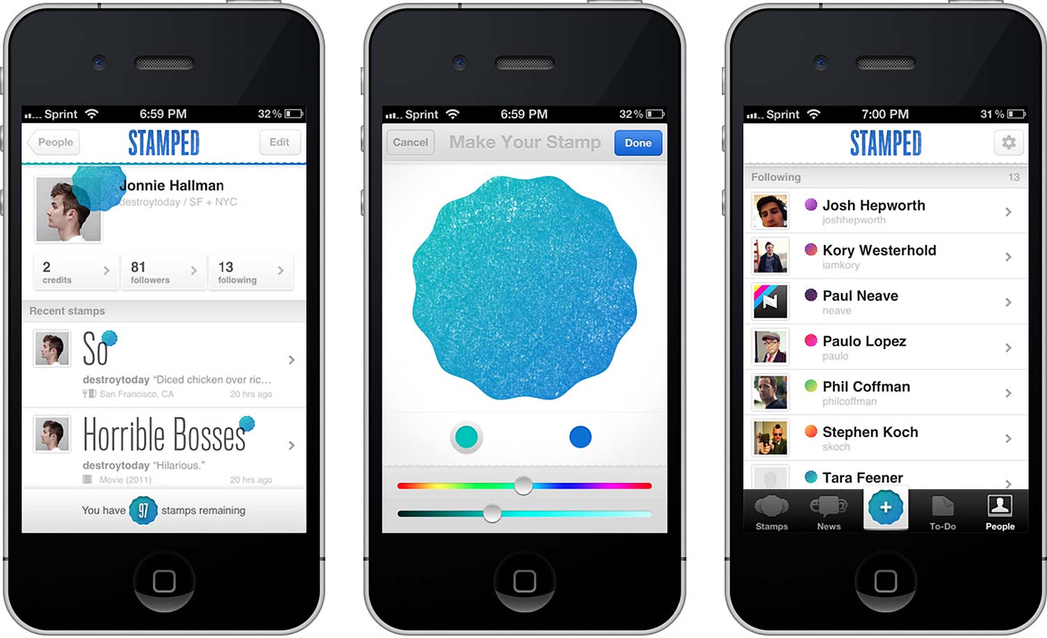
An app called Stamped launched earlier this week and immediately caught my eye. The concept of ‘stamping’ something you like didn’t wow me, but I did fall in love with the idea of personalizing yourself through a stamp color. Many apps and services these days rely solely on a username and avatar to distinguish users from one another. Because of this, signing up with a new network feels almost routine. When signing up with Stamped, however, I was caught off guard.
It’s not everyday you come across a color picker in a registration form. And the colors you choose carry a significant weight, representing you to others, all the while following you throughout the entire app—on the stamps, on the stamp button, even on embellishments like the horizontal rule of each profile. This experience makes me feel more connected to the app, like I contributed to the design in a small way.
Personalizing each user with their own stamp is strong and I can’t say I’ve seen this before. It’s a unique way of making the user feel comfortable without letting the customization get out of hand. Most of Stamped’s users won’t be designers, but by providing only two variables, it’s highly unlikely someone will pick a color combo that makes the app look bad. And that’s what we should strive for—give the user enough personality to feel a connection without risking degradation of the overall look.