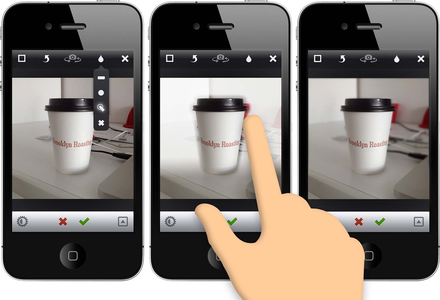
Depth of Field drawing in Instagram
navigateleft February 12, 2012 navigateright

I know, I know. Instagram again? Yes. I originally intended to pick a different app each time, but I find myself wanting this feature on a regular basis, so I just have to get it off my chest.
Instagram has a feature that’s pretty common among photo apps—tilt-shift. Now, tilt-shift is an advanced feature in the SLR world. TS lenses are typically used for architecture or interior photography to even the perspective and a good one will run you a solid $2 grand. Somewhat recently, tilt-shift became the hot new thing because it can make a landscape look like an HO-scale train set. As a result, every photo app added linear blur to fake the effect of tilt-shift.
The problem here is that every app has this advanced feature, but they all lack a pretty basic one—depth of field. Sure, you could do what I do and use the tilt-shift tool to emphasize the depth of field, but if you shoot any organically shaped subjects, it’s tough. That’s why I call for ‘depth of field drawing.’ The concept is simple. Using your finger, draw the area you want to blur. This way, you can produce a stronger depth of field around any shaped subject or subjects.
pointing hand courtesy of Gesturecons