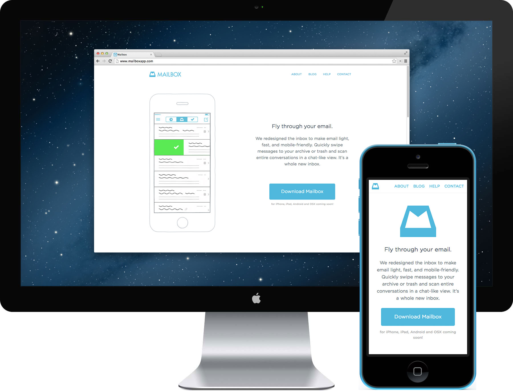
While in-house at Dropbox, working on the Carousel website, the PM for Mailbox, Liz Armistead, caught a glimpse of my work on the mobile website. She leaned in my direction and asked about my availability—would I have extra time to also take on the Mailbox website? Over the years, I’ve realized that I work best under pressure, but two major projects with the same deadline is floor-of-the-ocean pressure. Continuing a pattern of complete disregard for personal health, I said yes.
The design of the website took a number of turns before I was given the green light. Morgan Knutson led the final version, landing on using videos to demo the many gestures within the app. Upon scrolling the website, the videos will autoplay once they come into view. When a video falls out of view, it pauses. It’s a straight-forward approach, but very effective, showcasing exactly how the app works without hitting you over the head with effects.

The responsive side of the Mailbox website is all about replacing content. Reflowing down to the tablet breakpoint, the website first swaps out all videos for stills. As it narrows to the phone breakpoint, icons replace the stills and the top image is replaced with the Mailbox logo. The most complex part of the responsive implementation would definitely be the line of devices at the bottom of the website—the phones fit perfectly together, but at smaller scales, the laptop is too much. Because of this, I move the laptop below its copy when it hits the phone breakpoint.
Though the Mailbox website wasn’t as ambitious as the Carousel website, I feel its strength lies in its restraint to not go over the top. Because the app’s ease and simplicity is its main appeal, the goal of the website is to showcase Mailbox’s key gestures and get users right into the app.