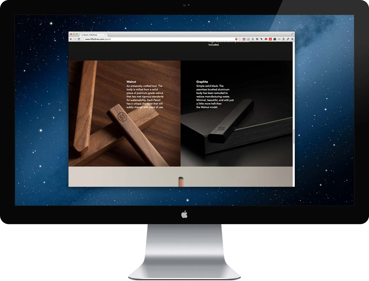
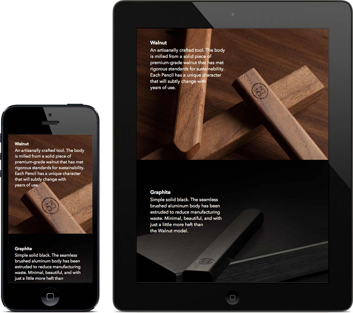
FiftyThree has always been an inspiration of mine—their dedication to craft is admirable. When they asked me to work with them on the product page for their first piece of hardware, Pencil, I jumped at the opportunity.
The project started out with a meeting at the FiftyThree office—a beautiful loft in Tribeca. KJ Chun walked me through the design he prepared for the page and Ian Curry showed me a few interaction prototypes for the fancier sections. I wore the serious professional face, but on the inside, I felt like a kid on Christmas Eve, and Santa was giving me a sneak peek at all my presents.
The Pencil product page was my first foray into scrolling effects—no pressure. I’ve never been a fan of scrolling effects, mainly because most implementations hijack the scrollbar. With that in mind, I coded it in a way that would maintain the integrity of the scroll, while still surprising the viewer. I wanted the parts to reveal themselves as if you could feel them sliding out. The animation works when resizing the window as well, so if you drag from the bottom, you can actually pull the pencil apart.
The “Inspired Form” section was originally designed to rotate the pencil with the horizontal tracking of the cursor, but it felt unnatural. If someone were to scroll the entirety of the page, they might miss it, as it required them to stop and move their cursor perpendicular to the scroll. As an alternative, I experimented with scrolling to rotate the pencil, so everyone would discover it. The pencil starts by facing left and rotates a full 180 degrees, exposing the front of the pencil half-way through. Luckily, this accomplished the natural feel I’m always aiming for in my work.

The page is fully responsive—even the scrolling effects. The FiftyThree team was open to suggestions on how to reflow the content across each breakpoint. I took a few cues from their existing product pages for consistency, but also tried a couple new directions of my own.

After a long week, I handed the code off to Tara Feener and Scott Olson, who prepared it for production. Not knowing when it would launch, I continued with my other work, but kept an eye on the site. A few Twitter mentions started to roll in and I knew it was live. I couldn’t be happier with the end result, as well as the response. It was an absolute privilege working with the FiftyThree team and tagging along for a small part of their adventure.